What happened to the Rishi Sunak I knew at school?
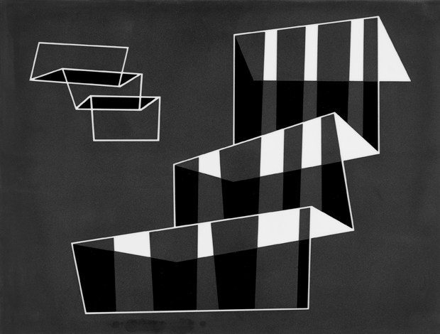
One of the features that continues to attract and hold my attention in Albers’s work is the mixture of the hard-edged and the brushy. This is particularly apparent in the just off-square large painting entitled ‘Movement in Gray’ (1939), in which roaring diagonals play off against smaller triangles, enclosed within a brushy black form. The pale internal shapes are subtly modulated in grey and off-white, but the brushiness is misleading. Albers habitually applied paint with a palette knife, with which he brought his colours into alignment: they touch, but do not overlap (except in the silkscreen prints he made), and far from being solid they waver and hover. Unexpectedly, Albers turns out to be a master of haloes. To the left of this painting hang two landscape-format studies from the Kinetic series, the wobbly edges of their forms deliciously vibrant, their dirty whites an absolute virtue. On the opposite wall are three sandblasted opaque flashed glass pieces, two of them of house interiors. The third features two sets of steps, folding and unfolding every which way through space, in a striped dynamic faintly reminiscent of deckchair canvas.
The beguiling distribution of space in Albers’s pictures is much to do with his use of paint and line in close collaboration. Although his work is very linear, it is seldom graphic — it evokes rather than describes. The lines are there to anchor form but also to allow the spirit to soar beyond their confines. The square within a square within a square is not a reductionist progression but a means of invoking infinity, just as colour is not definition so much as motion. In the main gallery space hang three small studies for the ‘Homage to the Square’ series. These are grouped together, followed by a gap, caesura, hiatus or pause. This perfectly pitched and phrased empty passage of wall intervenes before the eye reaches the larger and more majestic ‘Homage to the Square: “Half Past”’ (1966). This inspired piece of hanging beats gently at the very heart of the show.
On the adjacent walls are more ‘Homage’ paintings and three ‘Variant/Adobe’ pictures. These rectilinear images are like primitive temple façades, or the facias of old-fashioned wireless sets, or indeed stylised masks. Again, note the precise imprecisions: the variants of width and interval, the seemingly overlapping areas and the hand-drawn lines.
In the back room are nine small colour paintings to remind us what Albers could do with brighter and more obvious hues. My favourite is ‘Variant/Adobe Red, Violet, Rose around Orange’, though all here vibrate in thrilling colour combinations. Look, for instance, at the vivid blue, warm grey-brown and claret/magenta of another surprising ‘Homage to the Square’. A side room contains machine engravings on black vinylite mounted on board, lucid structural constellations in white and black lines and varied texture. These are wonderfully crisp and tonic, so visually satisfying, ludic but serene. In this area of the gallery are some of Albers’s own source photographs, some of them taken on his many trips to Mexico. Most have a strong linear thrust: railway tracks, twiggy saplings in the snow, a stairway, sand ribbed and rippled by the tide. Here, too, is the painting for the sandblasted glass ‘Steps’ mentioned earlier, and a series of graph-paper drawings called ‘Graphic Tectonic’. Finally a group of six Arp-like treble-clef paintings in gouache on paper that I’m sure Patrick Caulfield (another Waddington favourite) would have liked. It’s an exhibition of impressive range given its self-imposed limits.
I have been looking again at the 2006 commercial edition of Albers’s beautiful book Formulation: Articulation, published by Thames & Hudson with an illuminating text by T.G. Rosenthal. It demonstrates the thoughts and ideas of an artist’s lifetime through a series of brilliantly modulated propositions. Albers also wrote rather well and formulated his philosophy thus:
‘The origin of art: The discrepancy between physical fact and psychic effect.
‘The content of art: Visual formulation of our reaction to life.
‘The measure of art: The ratio of effort to effect.
‘The aim of art: Revelation and evocation of vision.’
The exhibition at Waddington Custot is of museum quality and deserves the serious (and inevitably delighted) attention of anyone interested in the visual arts. It is accompanied by an elegant hardback catalogue replete with essay by the doyen of Albers studies Nicholas Fox Weber, executive director of the Josef and Anni Albers Foundation. His text is an affectionate tribute to Leslie Waddington, larded with useful comments and observations about Albers. He calls the subject of the exhibition ‘the vast, paradisiacal territory afforded by black and white when they are treated by a master’. Not to be missed.


Comments
Join the debate for just $5 for 3 months
Be part of the conversation with other Spectator readers by getting your first three months for $5.
UNLOCK ACCESS Just $5 for 3 monthsAlready a subscriber? Log in